Air Up
2023
The objective was to seamlessly combine the necessity for clear navigation with the spotlight on the brand's primary product—water representation. This was achieved through the application of diverse visual effects rooted in perception principles.
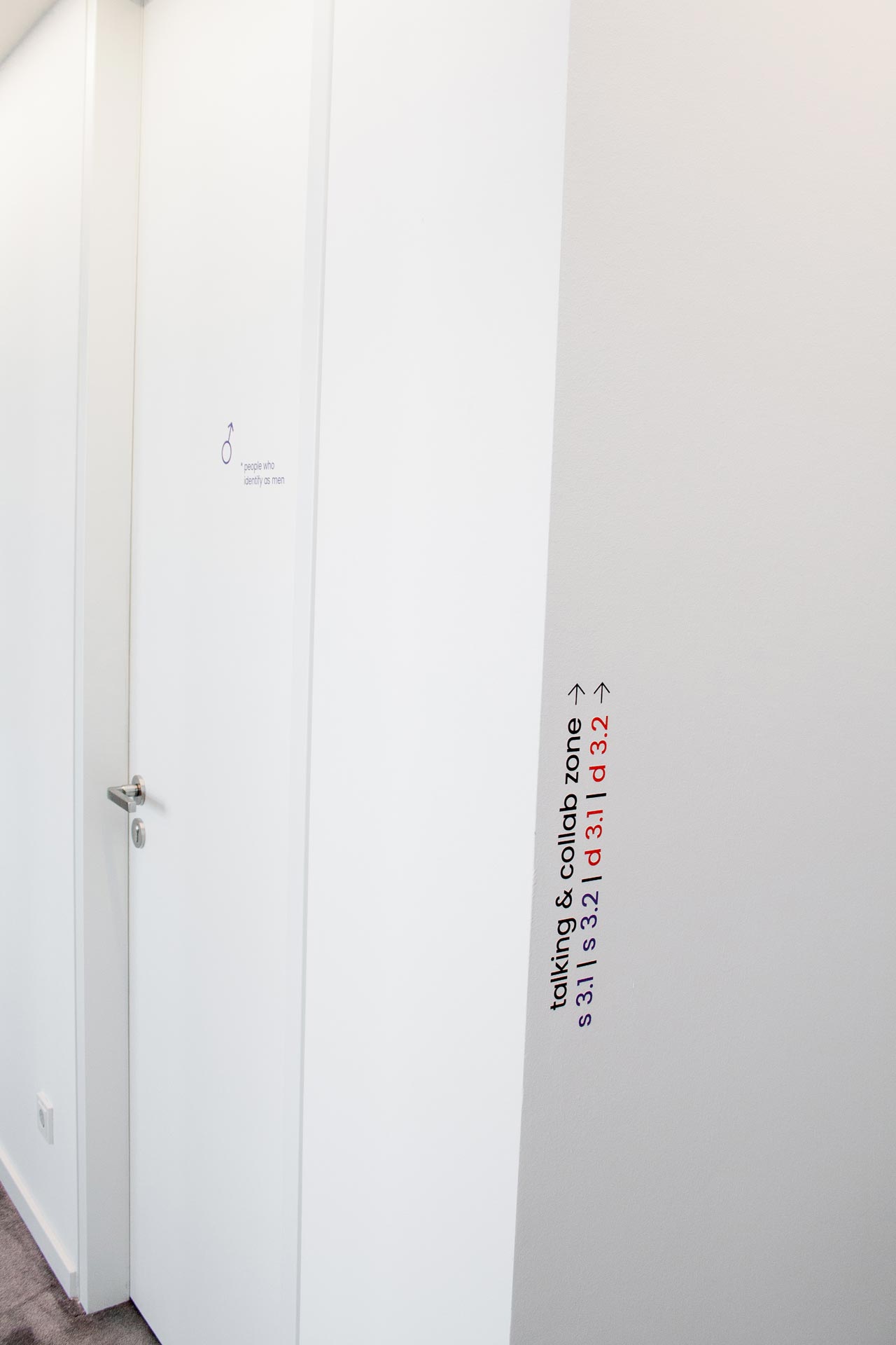
The orientation system utilizes custom iconography and text in two distinct font sizes. The smaller font directs, while the larger grey one designates the current location. Engaging in a subtle play on perspective, both texts appear identical in size from a specific viewpoint, aligning with the principle of size constancy.
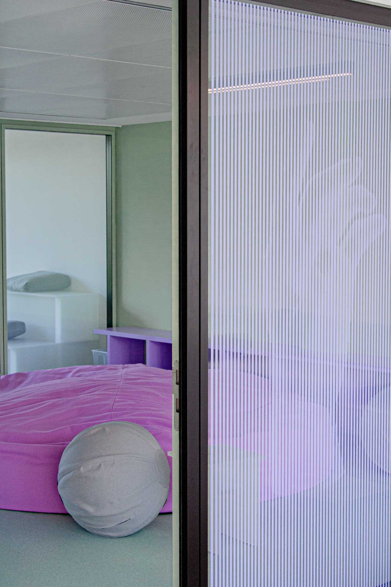
It also incorporates the brand's attributes and product features, delving into two unique perceptual sensations. To ensure privacy in spaces, we crafted two types of visual covers. The first features a concealed image visible from a specific distance, capitalizing on the perceptual law of closure. Drawing inspiration from the fluidity of moving water, the second cover employs dual layers of window films to bring the brand's slogans to life as floating text, creating a captivating visual effect.